Portfolio Website
Role: UX Designer & frontend developer
Overview
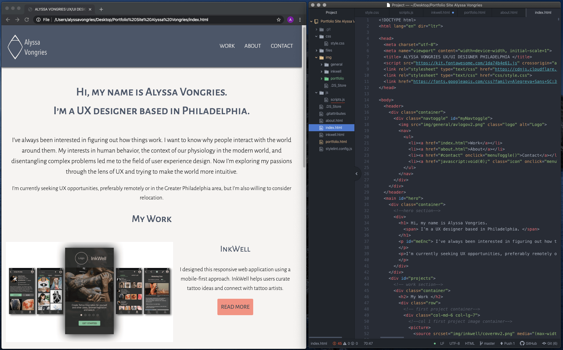
The following case study covers the process I followed and lessons learned while building my portfolio website. I chose to code this portfolio by hand so I could gain a better understanding of front-end development.
Outline
Purpose and Context
The purpose of this project was to create professional portfolio for myself. This project began in November 2019 and ended in January of 2020.
Objective
In order be employed as a UX designer in the future, I needed to have an accessible online space to present my burgeoning skills in user experience design and the relevant skills I already possess.
A professional portfolio website gives me an online presence which I didn’t previously have and allows me to show documentation of my process. Building this portfolio also provided me with several opportunities for growth.
- First, the portfolio site itself is an opportunity to work on creating a usable product. One of my target audiences is potential employers. My goal is to ensure that they are able to easily access data about me such as my contact information, resume, background information and portfolio pieces. If the site is broken, confusing or isn’t pleasant to use, then I will not be able to convey my information.
- Second, this portfolio website allowed me to gain a better understanding of front end development. I have always believed that teams work better when team-members have an understanding of each others jobs. I coded this site by hand and now have a more in-depth understanding of what front end development entails. I also have some insight into what challenges developers may face.
Functional Requirements
- Navigtion method to get between all pages
- Homepage
- Short introduction to me
- Links to project/portfolio piece pages
- About Me Page
- Personal introduction
- Resume access (PDF in separate window)
- Outline of my Skills
- List of the Tools I use
- Two portfolio piece pages with case study/showcase
- Contact section on each page
Technical Requirements
Website must work:
- On all screen sizes
- In latest browsers (Safari, Chrome, Firefox, Edge)
- With keyboard, mouse and touch inputs
Process and Insights
I began by gathering, curating and taking stock of all the content I would need. Images and files were also formatted into png, jpeg and PDFs as appropriate. This project was designed using a mobile-first method. All coding and layout began with the mobile size and then screen breakpoints were added to accommodate larger screen sizes. Wireframes were used as a reference while coding.
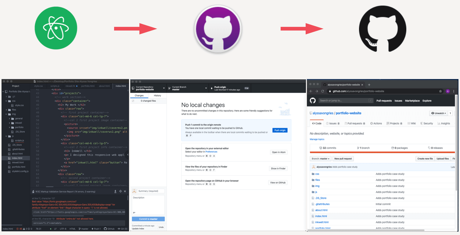
Atom was used for the text editor and the pages were completed according to the initial wireframes. At this time, the toggle menu function was written for mobile. GitHub was used to host the portfolio project and GitHub Desktop as a git client.
User Testing
After initial HTML, CSS and JS was written, user testing for the first iteration was conducted. Several problems with the site became evident. The image below is a brief summary of the issues and which ones were addressed in the latest iteration and which will be addressed in future iterations.
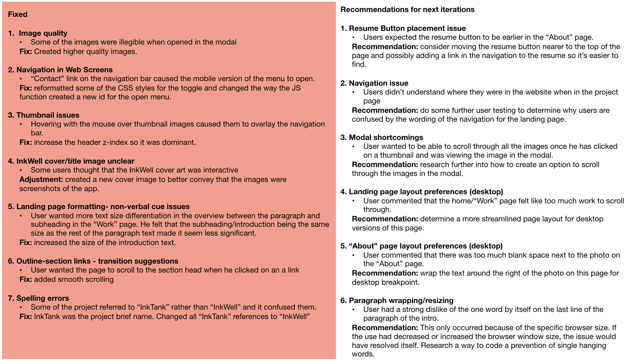
The issues addressed were selected based on severity rating and ease. All the issues with a severity rating for 3 or 4 and the issues which could be easily and quickly fixed, such as spelling errors, were addressed.
To see the entire test report with script and results, please see the below
Debugging and Cross Browser Testing
I used separate linter plugins for the HTML, CSS and JS to catch some of the basic coding errors. I ran into some issues with the linter plugins being out of date or giving strange suggestions. For example, The CSS linter was flagging all the times I had used variables for colors as a parse error. Redefinitions of properties at screen breakpoints were also being flagged. Of the linters, the JavaScript was the worst; it flagged all semicolons in the code. I ended up running the code through an online checker in addition to the plugins and only made the appropriate updates. Once this was complete, I conducted manual cross browser testing for the following browsers:
- Chrome
- Firefox
- Safari
Firefox and Safari were both formatting the InkWell project overview links in the dark accent without the underline for the first and last list item and then underlining each of the other items in the accent color (pictured below). The code was intended to underline all the links in the dark accent color when highlighted. I actually decided I liked the color differentiation because it made the link easier to identify. I reformatted so that the text and underline for all list items was the accent in hover state and dark accent with no text decoration in standard state.
Firefox was also formatting with he list item bullets offset from the list item text. I removed the bullets all together because users were confusing this list with the tools and skills list on the “about” page (which is also bulleted).
Accessibility
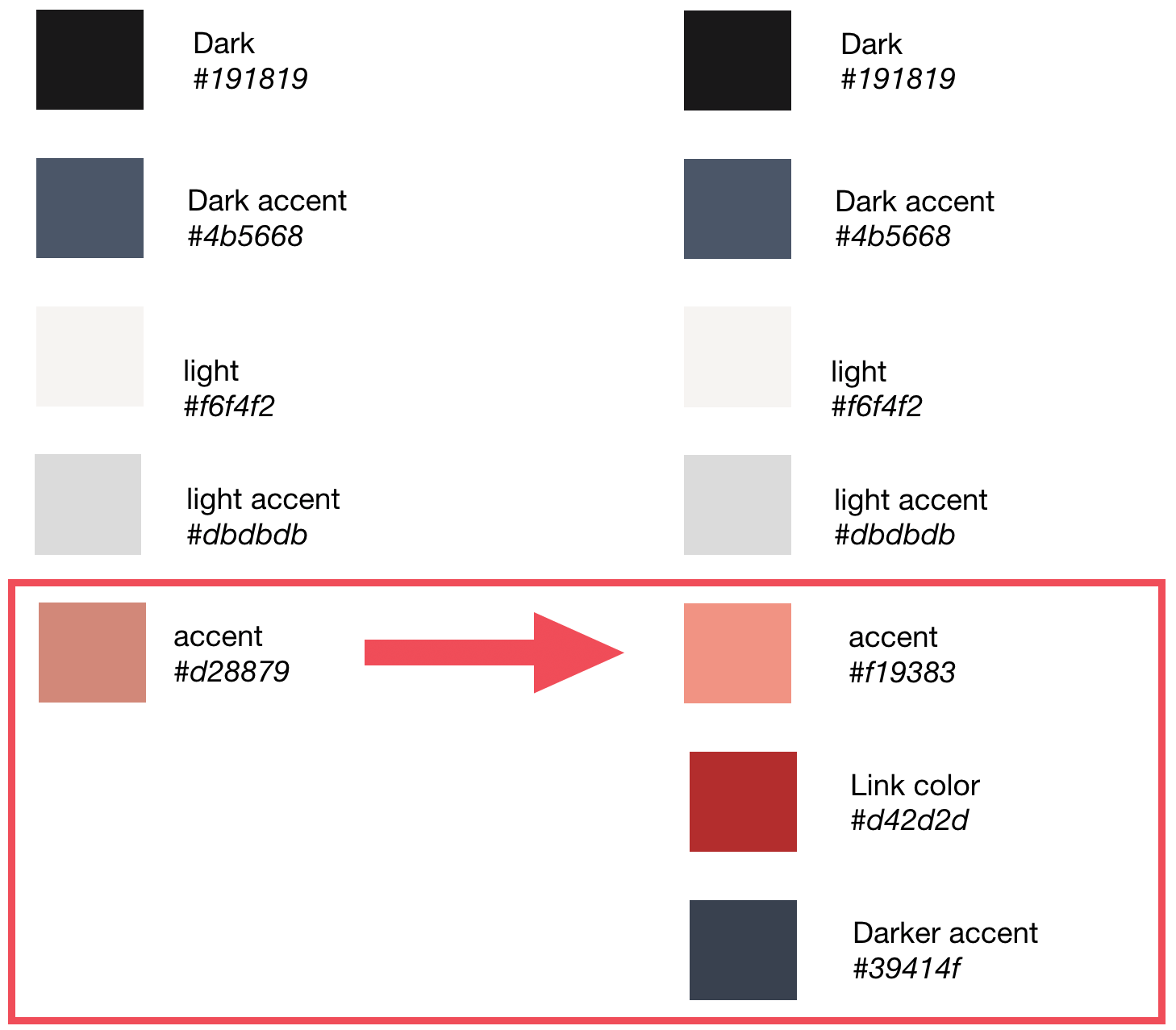
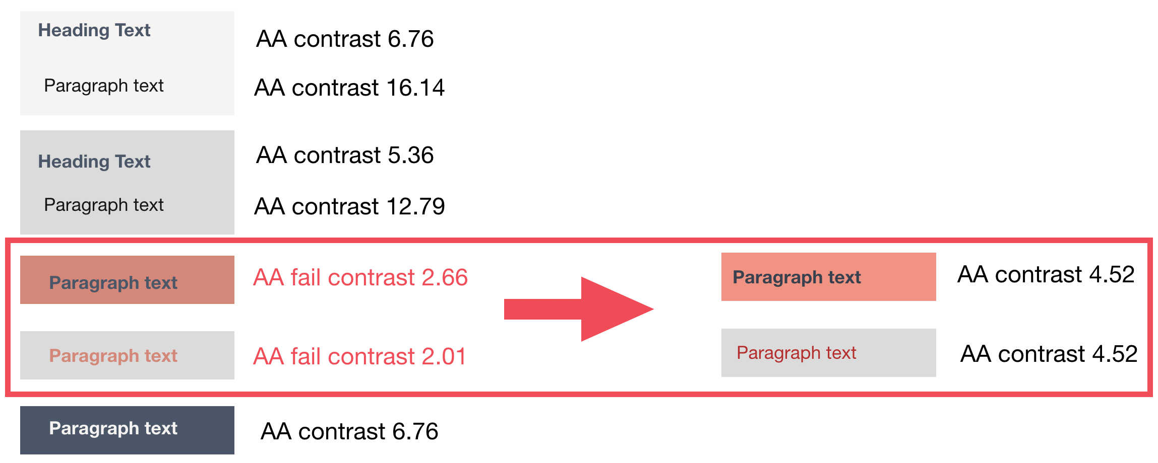
The color palette initially chosen for this site was examined for accessibility. Most of the palette passed well, but a few changes needed to be made to meet the AA using WCAG 2.0 guidelines for contrast accessibility.
The links (accent color) on the footer (light accent) did not meet contrast requirements. So I added a specific color for links which is darker. The buttons (dark accent text on accent background) also didn’t meet requirements. A darker accent color was to the palette and it has enough contrast on the accent color to meet AA requirements. I chose this rather than using black because the black on the accent felt too stark. The accent color was also brightened to give a better contrast.
Challenges, Solutions and Iterations
Navigation
The main navigation for this site is a responsive navigation bar that changes at the screen break between mobile and tablet. For mobile, the navigation is a hamburger menu and for tablet and desktop, navigation items are inline.
Challenge
When the “contact” link was clicked in the desktop or tablet version of the navigation, the hamburger menu would pop open and stay open. The mobile navigation would work perfectly with this code.
Solution
I discovered that I needed to revise the JavaScript function so that it added a new class when the menu was opened instead of adding a class by tagging extra letters on to the end of an existing class. I updated the CSS to restyle the existing class and add the new class stylings.
Smooth Scroll
At the beginning of the project, I felt that the project pages were unwieldy without some sort of outline and method of navigation within the page. I used links to anchors in the sections to provide users with a navigation directly to sections within the page. I’ve seen this method used in other sites.
Challenge
However, after user testing, it became clear that the abrupt jump to the section was confusing and users didn’t know where they were on the page. One user actually specifically mentioned that he would like the page to scroll to the section so he knew where he was on the page.
Initially, I couldn’t get the smooth scrolling to work at all. When I did find code that worked and which I could understand and implement, the scroll was stopping on the section in questions, but past the section title.
Solution
It appeared that the navigation bar was changing the scroll. I added padding to the anchor class, which partially solved the problem. The scroll is now stopping with the section title in frame, but not at the top. And the titles aren’t always in the same place on the page, adding varying amounts of padding doesn’t appear to solve the issue.
Iteration
The next set of iterations will include a solid solution to this problem.
Users can’t see the quick links once they’ve navigated to a section. They either have to scroll through the page or scroll back up to the top. Another navigation bar that’s always visible could provide a solution. I’d like to investigate possibilities for future updates.
Lightbox
I felt that the images in the project pages were too small and were difficult to read. I wanted to give users the ability to enlarge images by clicking on them without losing their place on the page.
Finding a function that was short and easy for me to comprehend and implement was difficult. I took me some trial and error to get it to work. It’s very rudimentary, enlarging an image when it’s clicked and making the background dark.
Challenge
Initially after I got the modal the work, the image thumbnails would overlay the navigation bar when a user hovered over with mouse or keyboard.
Solution
I changed the z-index of the navigation bar so that it was higher than any of the other elements on the page. This solved the issue.
Iteration
In future iterations, I like to implement a lightbox which would allow users to scroll through all the images in the page after opening one of the images from the thumbnail.
Future Considerations and Reflection
There are several other ideas I have for future iterations. I’d like to learn to add animations of the functionalities in the page so that readers can see what I’m talking about in real time. I also plan do conduct more user testing. I’d like to conduct some A/B testing, for example.
This portfolio has very limited functionality compared to most other projects. The main advantage of using it to continue UX investigations is that it’s small scale, so the likelihood of confused data from conflating factors is lower. There’s not much to get in the way of what data is saying. I think this will make it easier to get down to the root cause of any problem. It’s also a good place for exploring. If I chose to do something outside the box in future interaction and it doesn’t work, there’s no outside investor loss to worry about.
Building this site has given me better context for where UX fits into the product development. It’s also given a taste of how complicated it can be to keep everything in mind when coding a project from a wireframe or prototype. I’d like to continue learning more about various functions required on product development teams.
Credits and Links
If you're interested in the underpinnings of my portfolio, you're welcome to take a look at the GitHub repository linked below. I've also included a link to my codepen account, where you'll find some small introductory code experiments.
