AdamTicknor.com
Role: UX Designer
Overview
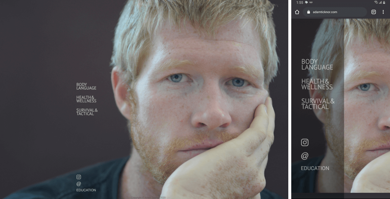
adamticknor.com is about bringing ideas together and making a cohesive experience for the user. Below I discuss and show some of my process and how I thought about the user, the client and the information he has to impart.
Challenges
This project was a challenge for a number of reasons. There was no copy for this website. There were no online courses. There was no logo, no brand direction, no existing audience to analyze.
We just an idea of what was possible. Adam had been trying to figure out how he was going to build this website for years. He had an old blog (circa the days of livejournal) and a LOT of information to share. Based on research, there is no other website covering all of these specific topics. So while I did due diligence and researched competitors in each topic field, I knew structuring was going to be a challenge.
I knew this would be a text heavy website and, surprisingly, one of the largest struggles on this project was figuring out the copy. It was an interesting task to discuss and decide what should be shared and how to pare it down into a story.
This was also an exciting project because I’d only ever built my own rudimentary portfolio website. I’d never designed and built a website from scratch and I had never really done any visual design.
Objective
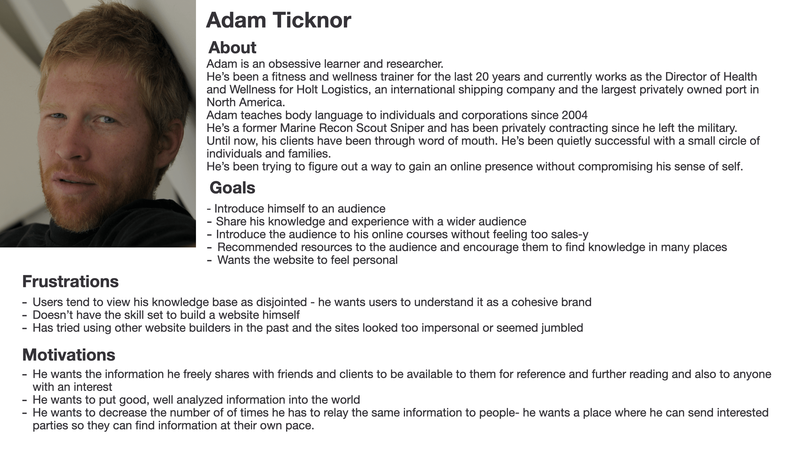
To determine the objective and scope of the site, I created a client “persona”. In this case it’s not technically a persona because the client isn’t hypothetical/representative, but having distilled client information in one place helped me stay on the right track throughout the project.
Functional Requirements
- Navigation method between all pages
- Website needs to be designed to share the following information:
- Body Language
- Rehab
- Nutrition
- Fitness
- Survival Skills
- Tactical Skills
- Bio/About
- Contact Information
- Resources (guest blog posts, videos, TV shows, Books he’s contributed to)
- Resources (recommended books, videos and websites
- Blog Page
- Navigation to education Platform/courses
Design
Basic Architecture
I analyzed all the topics/information that the website was to address. After assessing and reading all the planned information, I grouped all the topics into three categories. These three categories would each have a website page, as shown below.
Body Language
- Body Language
- Topic specific
- Resources (guest blog posts, videos, TV shows, Books he’s contributed to)
- Resources (recommended books, videos and websites)
Health & Wellness
- Rehab
- Nutrition
- Fitness
- Topic specific
- Resources (guest blog posts, videos, TV shows, Books he’s contributed to)
- Resources (recommended books, videos and websites)
Survival & Tactical
- Survival Skills
- Tactical skills
- Topic specific
- Resources (guest blog posts, videos, TV shows, Books he’s contributed to)
- Resources (recommended books, videos and websites)
Sitemap
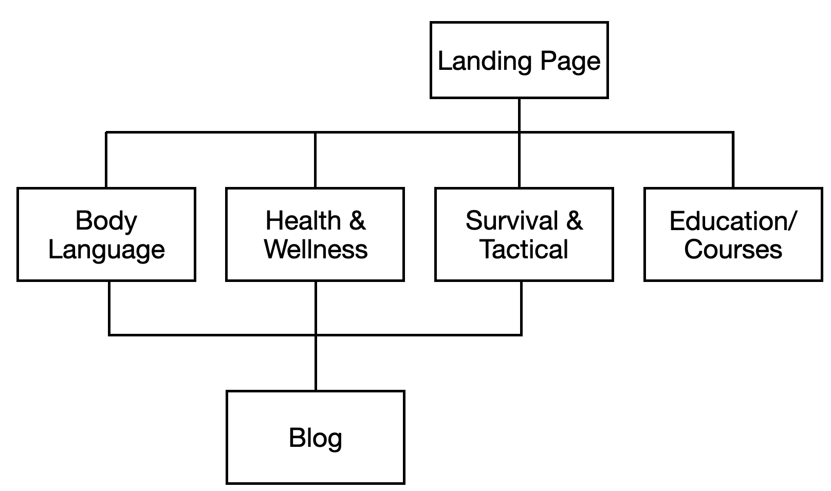
Once the main topics were grouped, I looked at the rest of the information and built a sitemap which would encompass all the necessary information and functional requirements in a logical manner.
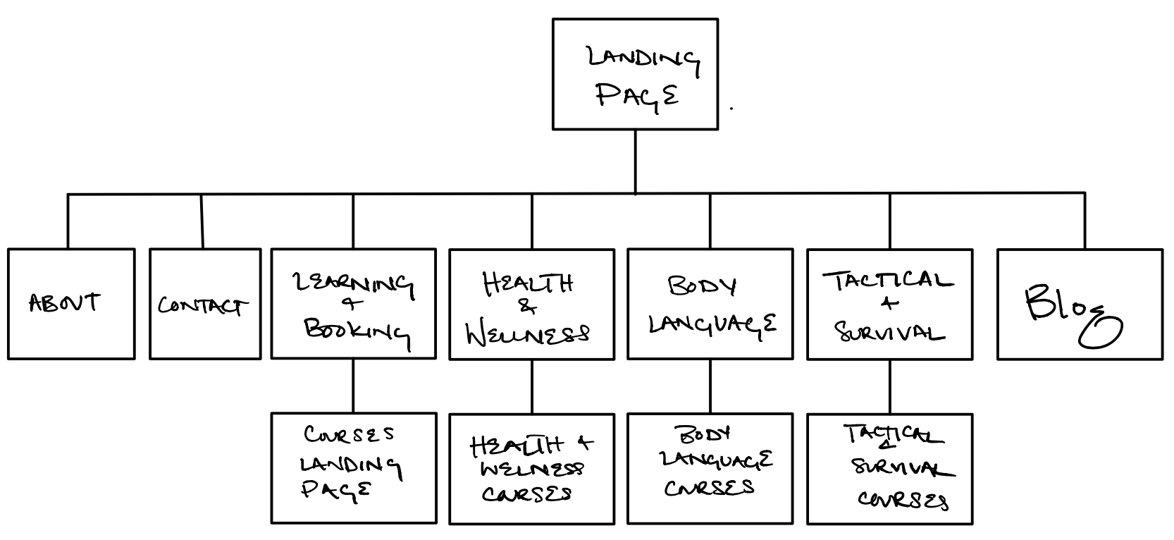
After some thought, sketching wireframes, plotting content and mapping how and why a user would navigate from one page to the next, I refined my sitemap.
I wanted the site to be easily navigable and streamlined, so I wanted as few pages as necessary. In order to reduce cognitive load for the user:
- Removed the “about page” and places topic-specific bios on each page instead.
- Removed the “contact page” an contact information to the footer of each page. I fixed the information to the bottom of the page so that it’s available for users when they need it.
- I removed the blog page from the landing page navigation so that it’s only accessible after the user has navigated to one of the three main pages.
Wireframes
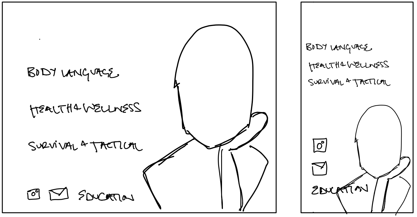
Landing Page
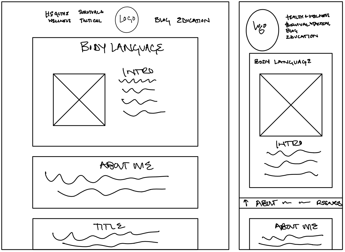
Main Topic Page
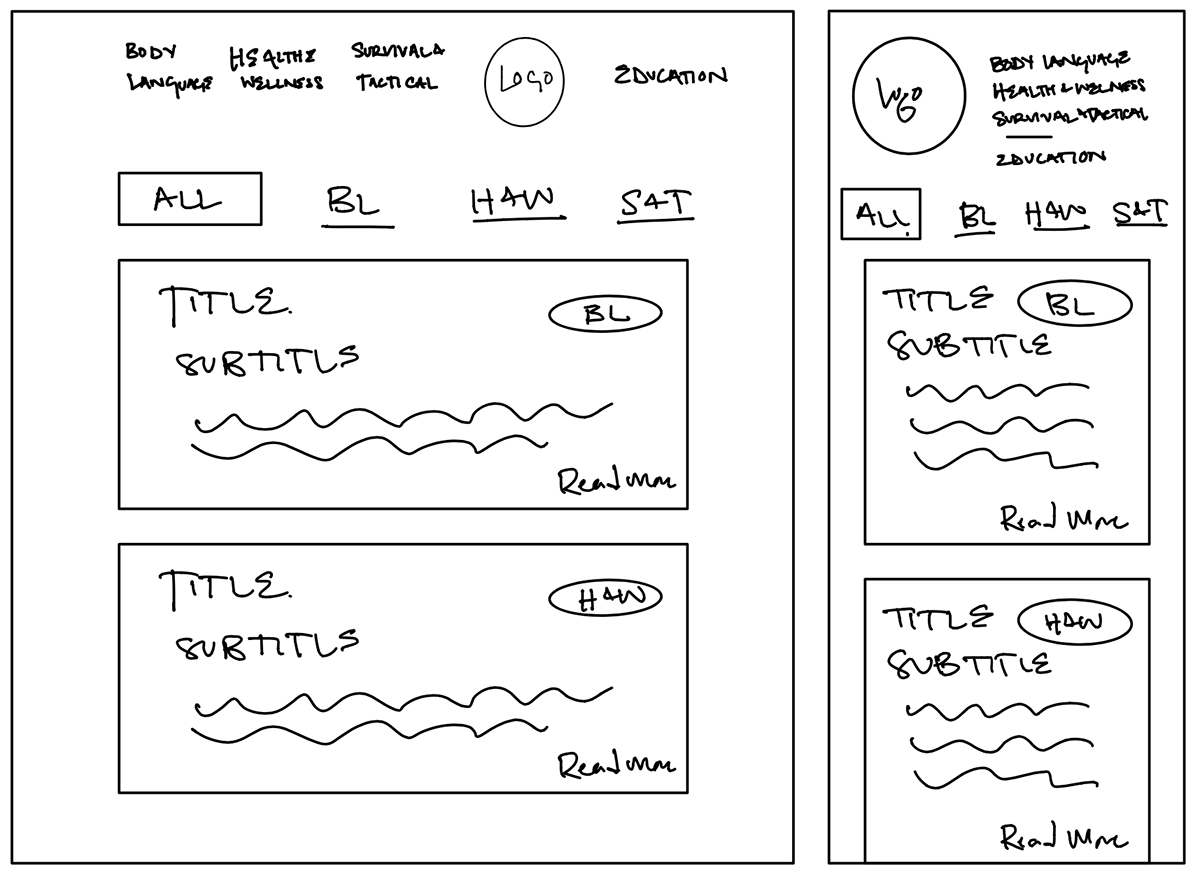
Blog Page
Prototypes
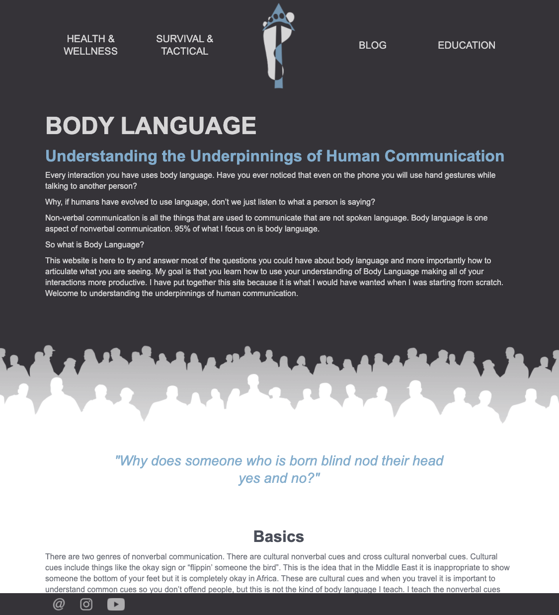
Main Topic Page
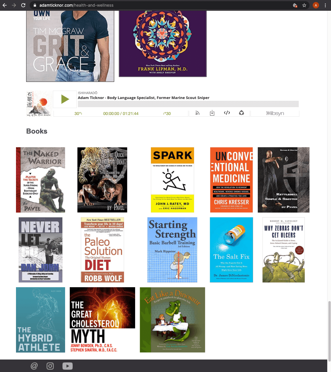
Resource Grid
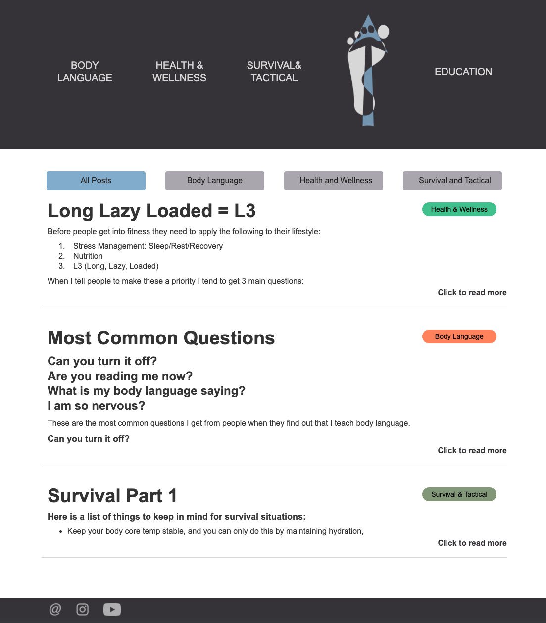
Blog Page
Design Decisions - Features and Visuals
Navigation
My goal was to streamline the navigation as much as possible. I didn’t want users to have to scan through a bunch of options and think about where they had to go.
I could see two ways to do this:
- keep nav the same on all pages but visually denote the current page by changing the color/denote it visually
- Remove navigation items when on the corresponding page.
I wanted the navigation bar to give as few options as possible, so when the user is on a given page, that page is not an option on the nav bar until the user navigates to a different page.
For the mobile versions of the site, I decided against hamburger menu. I did not want the options to be hidden. Removing the current page from the navigation bar also made it easier to fit all the options into the navigation bar in mobile.
Resource Grid
I wanted to make links to resources seem more tangible. Adam had a lot of links to books, articles and PDFs included in the copy. I thought making visual representations of the items might make them easier to scan and remember. The most efficient use of screen seemed to be a grid. Users are used to grids from popular apps such as Instagram. There are at least two grids of books, articles and PDFs on each of the main topic pages. I think this also gives a bookshelf feel, which is very in-line with the background of bookshelves Adam currently uses for his educational videos.
User Testing
Testing Objectives
- Identify if there are issues with the user experience of the site
- Determine if the the website easy to navigate
- Find out if the user understands the purpose of the website
- Discover if users can find information they are looking for
Summary
What Went Well?
- “I like the color scheme. It feels militant without being too on-the-nose”
- “I like the book grid, it’s easy to see everything”
- “Good ergonomics, interesting yet not overdone graphics and images”
What Went Badly?
Finding the Online Course
- “I feel like if you’re selling something, you should let me know right way. I have to scroll down to the middle of the page to get there.”
Blog Page
- “All the blogs are on one page? I wish there were pictures. Oh you can sort by topic, that’s cool. ”
- “I do like how this expands and closes and that all the info is on one page.. I don’t have to go back a page to read the next..but there’s only three blog posts now. Will I have to scroll all the way down? And how do I send a friend a link to a blog post I like?”
What's Left?
Some of the user feedback needs a little more research.
Landing Page
- “I don’t feel like there’s enough information on the landing page. There’s no logo and I don’t know where I am.”
- “Oh, I like the landing page, he looks like a book author and it’s very simple”
- “I’m getting a cross between a surfer/ski bum and REI mountain man - but not serious in nature. I would like to see a more buttoned up version of him.”
Navigation
- “[the navigation] Seems pretty easy”
- “I don’t like the logo in the middle [of the navigation], move it to the left where I’m used to seeing it.”
- “I’m not sure how I feel about the navigation, that it changes when I switch pages.”
Iterations and Moving Forward
Iterations
Two main updates made based on participant feeback are discussed below. These are not the only changes that were made, but they are the most visible.
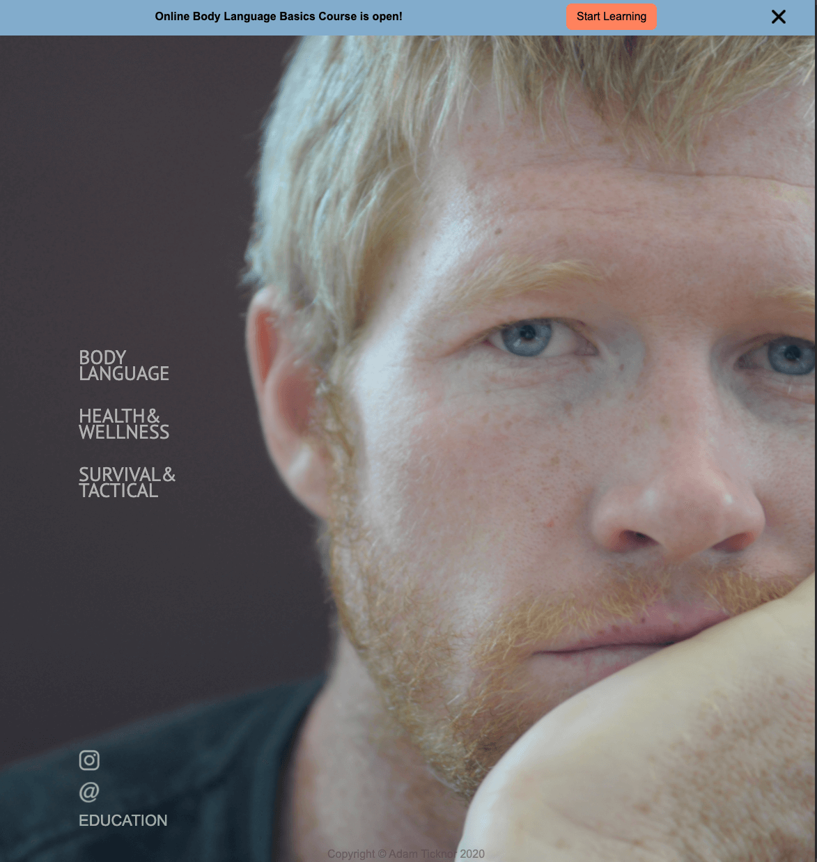
Course Notification Bar
Originally, the online course page could be reached by the "Education" link in the navigation bar from all pages and from a CTA on the Body Language page. Some users found these navigation methods quite easily, however a few were unsure that there even was an online course available because the button and video for the body language course was so far down the page.
The client does not want to move the course above the fold where it would be easier to see. He wants users to know that the information provided for free in the site is just as important.
So, a notification bar was placed at the top of each main topic page and on the landing page. If a user dismisses the bar, it doesn’t show up again on any page for three days. When other online courses are added, the bar will be updated to reflect changes.
New Blog Page
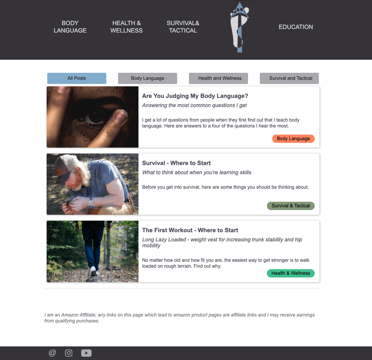
The blog page was changed almost entirely. Users liked that they could sort the posts by topic, but didn’t like that the posts were all on one page. Each post has been given its own page and the blog landing has redesigned so that each blog has its own card with a picture and relevant information.
Giving the blog post their own page also means that users can share specific posts with each other more easily, which may improve traffic.
Moving Forward
The next steps in this project are more user testing and iterations. This project doesn’t have the budget for formal user testing methods right now.
The study topics and objectives for the next tests will be shaped by user feedback, but two issues that will be addressed are the landing page and navigation.
Landing Page
There was mixed feedback from participants on the landing page. Some liked how simple and clean it is. Others think it doesn’t have enough information and is unnecessary. I need to do more research and dig into the issue. Before that happens, I do plan on prototyping and updating the page to include the logo.
Navigation
Based on the preliminary user testing, 80% of users aren’t confused the navigation. One user specifically mentioned that they weren’t sure about it/didn’t like it. Another participant specifically said that she liked how the navigation changed.
The navigation needs iteration, but it’s currently unclear what exactly needs to change. It would be simplest to just follow common patterns and put the logo on the left. I originally put the logo in the middle to separate the topic pages from the blog and education pages. I plan to do more user testing after prototyping some possible solutions.
Tools
I built this site using:




(Webflow, Photoshop, Vectornator, Notability)
In addition to building the website with Webflow, I also used it to create high fidelity wireframes and prototype this site. I did this because I wasn’t familiar with the capabilities and limitations of the tool. I didn’t want to spend a whole bunch of time making high fidelity prototypes just to discover that what I wanted to build wasn’t possible or within my capabilities.
I’ve since reverted to using Adobe XD as a mid/high fidelity wireframing tool. However, when building sites using Webflow, I will continue to prototype interactions. It allows me to see how everything will happen in real time. I can also post to a staging website and have users test in real time on the actual product. When all the interactions are perfected, I can just launch and it’s live (unless I’m using another hosting service).
Final Product
This website is live, but is still undergoing continuous iteration. Feel free to take a look.
